ChatGPT Revolutionizes App and Blog Localization

It has been a year since I started using ChatGPT. I mainly use it for programming and language translation, and the translation tasks, in particular, have been incredibly efficient.

Recently, I was able to make my Voicepaper app support 20 languages at once. ListTimer and Zeny can now support 12 languages. To be precise, I’ve had the help of an exceptionally talented person to multilingualize screenshots and text using ChatGPT, but the translation part is entrusted to AI, which has significantly reduced both speed and cost compared to before.

What’s different from the Google Translate era is the translation accuracy. When translating from English to Japanese, the awkwardness is significantly lower, and the same goes for the reverse. It has improved from a barely usable level to a practically usable one, so I started using it extensively.

I also compared it with DeepL, but personally, I find ChatGPT to be much better in terms of accuracy and usability. The best part is that you can copy and paste data files as they are and ask it to translate only the necessary parts while maintaining the format.

“RepeatThePlaylist” = “現在のプレイリストをリピート”;

“RepeatThePlaylist” = “Repeat The Current Playlist”;

The Cost of Multilingualizing Apps Has Dropped Significantly

Actually, a few years ago, I used a service called Gengo.com to multilingualize ListTimer into about seven languages at once. I would send the app’s language files with instructions on which parts to translate and which parts to leave as they were, and each file was translated at a cost per word.

This process was costly, had to wait several days for delivery, and updating all languages for minor updates within the app was extremely challenging. In the app world, even if you support eight languages, it’s often a matter of luck which language will drive downloads, so the cost and return did not match at all, and it was a failure.

However, the advent of generative AI solved this problem at once. It can handle it instantly and automatically determine the structure of the file for translation.

Moreover, translating buttons and messages for tool-type apps, unlike novels or movies, doesn’t have many critical scenes where the atmosphere would collapse significantly. Even if there’s a slight error, users can infer the meaning and use it. Therefore, except for a few important parts, it mostly suffices.

The End of Japan’s Galapagos Strategy?

Until now, Japanese web services have been viable due to the entry barrier of the Japanese language and the country’s considerable economic power. They could mimic high-level overseas services and create Japanese versions that could be commercially successful even at a moderate level.

However, from now on, developers from English-speaking and Chinese-speaking regions can easily support Japanese using AI. With low costs and high accuracy, the Japanese language barrier will gradually disappear.

Before rejoicing that it will become easier to sell in overseas markets while in Japan, there is a fear that most apps and services sold in Japanese stores will become foreign-made. While there are many services that are difficult to proceed without understanding unique Japanese customs, for simple apps, if the localization is decent, many cases will opt for those. In fact, the users of my household accounting app Zeny have become mostly overseas without me noticing.

Using AI for Blog Translation Can Lead to Ten Times the Readership

Translating blog articles using AI is even more straightforward than localizing apps. Previously, machine-translated blog articles were not at a readable level.

With the advent of ChatGPT, it translates to a level that can be published as is. Blog articles often get read randomly, so multilingualizing them becomes a great strategy.

In the past, I tried translating Japanese to English on platforms like overseas crowdsourcing sites, but it was costly and tedious. Now, using generative AI, I can translate and post them quickly.

For example, I wrote an article on a whim, translated it into English with ChatGPT, and posted it on HackerNews, which surprisingly went viral. It was entirely translated by generative AI.

While an article in Japanese might get about 100 views in a day, in English, it reached about 10,000 views. So, if you have a website or a blog, it might be a good idea to translate it into English.

Most cases will go unnoticed, but you never know what will hit, and the cost of buying that lottery ticket has drastically decreased.

*Notes

  • I’m using ChatGPT4, and when there are limitations, I use a service called TypingMind to use it via API.
  • Currently, the number of tokens for reading long texts is not an issue, but the output of translated texts stops halfway if the text is too long, which is challenging. Even with the latest Claude, it still stops. Google’s Gemini was unusable due to low accuracy. After trying various options, I settled on ChatGPT4.

*I've made Text-to-Speech, Money Tracker, and Timer apps. About Me.


I watched “Oppenheimer” in a packed theater in Japan, the atmosphere following the atomic bomb experiment was indescribably intense

The other day, I finally went to see the movie “Oppenheimer” that I had been wanting to watch for so long. It’s a Nolan film, and its historical background is fascinating, so I had been eagerly waiting for its release in Japan since last year.

Despite reading biographies and waiting, the release date in Japan was never decided, so around the end of last year, I almost gave up and considered ordering the DVD.

However, I thought this movie had to be watched in the overwhelming presence of an IMAX theater, so I patiently waited, and finally, I got to see it.

The theater I chose was the IMAX Laser GT in Ikebukuro. It’s a place with the highest quality sound and screen. I even became a member of the cinema to make an advance reservation. This might be the first time I put so much effort into securing a seat for a movie.

I made the reservation as soon as the time came, but the good seats sold out in minutes, so I was glad to be a member. By the way, my first experience with a premium seat was fantastic – it was reclining, wide, and just the best.

It made me imagine that this is how comfortable business class on airplanes must be, something I’ve never experienced. From now on, I want to watch all the main movies here.

The movie was three hours long, but the pace was good, and it went by in a flash. As someone who loves history and biographies of scientists, it was better than I expected, but most of all, the atmosphere in the theater during the successful atomic bomb experiment scene was incredible.

This atmosphere could only be felt in a Japanese cinema, and that too, in such a large theater full of Japanese people.

Actually, I was really looking forward to seeing this movie before it was released in Japan, but I thought that the indescribable atmosphere of the theater could only be experienced there.

This is because, as Japanese, from a young age, we learn about the tragedy of the atomic bombs in school, visit the Hiroshima Peace Memorial on school trips, and grow up watching various special programs on TV.

In our children’s literature, we also read ‘Barefoot Gen,’ a manga about a young boy’s experience with the atomic bomb in Hiroshima. As Japanese who grew up in Japan, we receive more education about the tragedy of the atomic bombs than people from any other country.

The moments leading up to and the instant of the atomic bomb experiment’s explosion were truly tense, and the music and tension made it seem like a scene that would remain in cinema history.

However, what impressed me the most was not the tense few seconds leading up to the experiment’s success, nor the incredibly portrayed explosion scene, but rather the scene where the team of scientists and staff joyously celebrated on-site immediately after the success.

The indescribable atmosphere in the packed theater at that moment was unforgettably intense. As Japanese, we can vividly imagine what the success of this experiment, which eventually led to the dropping of atomic bombs on Hiroshima and Nagasaki, would entail.

At that moment, I felt that over 500 spectators in the packed theater were probably sharing a similar emotion, an experience I hadn’t anticipated and found profound.

While the people on screen were celebrating the success of their project, the audience was filled with a completely different emotion, creating an incredibly powerful atmosphere.

I usually dislike crowded places and prefer almost empty theaters, but I’m glad I watched it in a packed, large theater this time. It was an atmosphere and a space I had never experienced before.

Apparently, the delay in the movie’s release in Japan was due to the major distribution companies being hesitant.

However, the movie also expresses the fear of possessing the tremendous power of nuclear energy throughout, making it a must-watch film.

It also connects to the theme of how we will control AI in the future, reminding us of the proposition that once something is known, it cannot be unknown, a thought-provoking movie indeed.


*I've made Text-to-Speech, Money Tracker, and Timer apps. About Me.


I made a comparison video between ChatGPT and iPhone’s text-to-speech

Hello. I am someone who, about 15 years ago, wanted to listen to web news and blogs via text-to-speech while doing other things, so I created a reading app. That app started me on a journey where I ended up living through apps.

Because of this, I’ve always made it a point to check the quality of the latest text-to-speech engines as they come out. For example, I thought Amazon Polly, which was released a few years ago, sounded quite natural, and I’ve noticed that the text-to-speech on the iPhone has been getting progressively better too.

Recently, a text-to-speech API of ChatGPT has emerged, and it sounds almost indistinguishable from a human in English, which I found astonishing. It’s so good that it could easily be used for making announcement recordings or similar tasks.

However, while I could listen to demos in English on the ChatGPT site, I couldn’t find any demos for Japanese text-to-speech. So, I ended up installing a Python environment on my Mac, something I’m not very familiar with, to actually call the API and make it read aloud in Japanese.

I’m updating an app I developed called Voicepaper, which reads aloud promotional text, and I’ve been comparing ChatGPT’s text-to-speech engine with that of the iPhone’s (the high-quality version you can download from the settings), in both English and Japanese.

To sum it up, ChatGPT’s English text-to-speech is incredible. Truly natural. It makes Amazon Polly, released a few years ago, seem less impressive by comparison. There’s intonation, so it doesn’t sound monotonous. However, the Japanese version still sounds a bit mechanical compared to its English counterpart, with odd intonations in places.

However, since ChatGPT’s voice API seems to be optimized for English, there might be significant improvements for Japanese and other languages in the future. The pace of AI evolution in recent times is astonishingly fast, so these improvements could come as soon as next month or take a few years.

I was researching this because I was considering integrating it into Voicepaper, which I’ve been diligently updating. If it’s significantly better than the iPhone’s native text-to-speech engine, it might be worth it.

I made a video to gather a wide range of opinions on this. I wanted to see if most people think it’s not much different from the iPhone’s engine or if many would be willing to pay extra for ChatGPT’s quality.

Text-to-speech engines might feel odd at first, but as you listen to web articles or books daily, you get used to it, much like getting used to a dialect, and the strangeness fades away. Personally, I’ve come to think that I wouldn’t pay extra to use ChatGPT for my listening needs.

However, it might be useful for creating voice files for videos or work-related announcements. For everyday use, I might stick with the iPhone’s engine and switch to ChatGPT’s high-quality voice for specific tasks. There are no licensing issues to worry about.

Additionally, while ChatGPT’s API allows for changes in speech speed and speaker, it currently doesn’t offer parameters for emotions. Modern speech engines can convey emotions, such as speaking in a sad or cheerful tone, which is impressive.

Using the API, I’m also curious about the potential latency in real-time server response, but ChatGPT’s API is designed to minimize delays and provide real-time responses. This will require further testing, but I’ll write more about it once I start integrating it.


*I've made Text-to-Speech, Money Tracker, and Timer apps. About Me.


Having a Game I’m Really Into Makes Every Day Incredibly Enjoyable

About a month ago, I became hooked on mahjong, the ultimate game. It’s a bit late in my life to start, but that’s how it is.

In the past, I might have thought, “Playing games like this would be ruinous, leading to personal downfall.” But now, as I’ve grown older, I’ve stopped worrying about these concerns and am thoroughly enjoying this obsession. I’m living in the moment.

Throughout my life, I’ve only occasionally found activities so captivating that I’d sacrifice sleep for them, perhaps once every five years.

First, there was soccer in elementary school, then guitar and drums in high school. After that, I got into FPS games and eventually found programming, which led to a career. Later, I enjoyed reading comics and books at a leisurely pace; it was more of a gradual enjoyment rather than an obsession that would cost me sleep.

A few years ago, I had a brief but intense period of playing Valorant, another FPS game. The daily happiness and the time spent improving during that period were priceless.

Lately, I’ve been realizing the value of having something that excites me enough to jump out of bed for it. So, I’ve decided to fully immerse myself in whatever comes next, knowing that these enjoyable times might not last forever.

Here’s the thing: whether or not these obsessions lead to something useful in work or life isn’t the main point, although they often do. More importantly, as various monks and philosophers say, the greatest happiness for humans is to live in the moment.

Apparently, when humans have free time, they tend to stress over the past and future instead of focusing on the present.

Thus, those who discover a hobby they can deeply immerse themselves in are fortunate; such passions aren’t easily found, even with ample resources. I hope this state lasts for a long time, but I know it won’t be easy.

Why? Because humans grow quickly from beginners to intermediates, but once they hit a certain wall, growth slows down drastically. You might even see your limits and feel like you can’t improve any further.

The most enjoyable time is when you feel yourself growing, but the real test is whether you can persevere when you hit that wall or if you’ll lose interest and give up.


*I've made Text-to-Speech, Money Tracker, and Timer apps. About Me.


As a solo developer, I decided to offer phone support, and this is what happened

This year, around February, I started offering telephone support for Taxnote, which I hadn’t done up until then, because the idea made me anxious.

I intended to quit if, at any time, I thought it was tough for me to do; but, so far, I have continued with it for over half a year, so I’ll update you on the things I’ve learned from doing it.

I wrote my phone number in the help section of the Japanese version only, since I live in Japan and it is a JP number. I might try it in English too in the future, if I can make it work with an international calling facility like Skype.

How often do I get calls?

For the time being, my telephone number is written on the help section of the Taxnote accounting application, and the recently released text-to-speech application named Voicepaper.

For example, when it comes to Taxnote, when you tap on the “Help” section on the settings screen, it shows “Inquiry by phone call” right at the top; in other words, it’s made so that people who go to the help section realize straight away that they can contact us by phone.

By the way, the application doesn’t have a high number of downloads, so it’s a question of whether I’ll receive even 1 phone call per day. Once in a while, I get 2 phone calls in one day, but even that isn’t a large amount, so it’s on a level at which I don’t feel the burden very much. If they were to call me all the time, perhaps it would be more intense.

Still, when you’ve been doing it for over half a year, all sorts of people call you, and I’ve really learned a lot by talking with users directly on the phone.

Most users are polite

This may be a virtue of the Japanese, but, basically, everyone who calls is civil and polite. It often goes something like: “I’m terribly sorry to bother you, but there’s something I would like to ask…” and I respond with something like “No, of course, of course…”.

I think it’s probably like this because the application I work with is operated by a solo-developer, just me, and the approach is emotionally different from calling the support service of a large company. The people who call are probably being attentive.

However, there is the disadvantage of people thinking along the lines of: “Is everything okay with this app? It looks like its development is going to be abandoned, so I’m anxious about continuing to use it,” as when compared to a company. I don’t really know which is better when it comes to things like this.

I got sidetracked.

Ah, yes, everyone is really kind, and older men and women in particular, who are unfamiliar with IT in general, let alone Taxnote, express their gratitude immensely. I thought that something like being thanked for providing a support service was just to motivate the lonely app developer when I looked at the reviews, but when someone directly says this to me on the phone, I get ten times happier.

One time, an older lady passionately said, “I am a physical therapist, and compiling tax returns has been quite difficult up until now, but, thanks to this app, it has become much, much easier. I think it’s a superb app. Thank you so much.” Honestly, I teared up. I really cried.

You can detect critical parts of your product

Of course, there are times when a large problem occurs and I have to respond to angry phone calls. At those moments I earnestly apologize, but, when you have experiences like that, it really increases your determination to fix the problem.

As a matter of fact, when it comes to large problems, offering phone support enables you to understand that inconveniences that occur when the app’s behaviors and messages are hard to understand are more frequent than bugs in the programming (when bugs crash the application, it’s easy to identify them through the log, and no reports are made with a phone call).

At those times, what might have been: “Well, this bit right here, it might be hard to understand,” changes its priority to: “Nope, we really need to provide a clearer explanation with the message, and improve it so that something isn’t misunderstood and handled wrongly…”.

In my last post, I wrote about how it’s easier to understand the problem or debug when you’re doing telephone support as opposed to messaging, since you can hear the circumstances from the client in more detail, but it’s also largely through emotions that the acuteness of the problem is expressed.

For example, when you always have an endless list of things to do, like improve the app or fix bugs, it’s always important to prioritize what to start working on first. At such moments, the numbers you see from the app data (like, for example, numbers from a crash) serve as a reference, but so do inquiries from support messages.

You make a decision by taking into consideration both the quantitative criteria, which you know from the numbers, and the qualitative criteria, which you know from the conversations. But, when you add telephone support, the qualitative criteria system rises up. As you might expect, purposely making a phone call takes some energy, and talking to a user helps you understand the critical points, such as, “This worries me,” or, “I don’t understand this.”

You can improve your listening skills

Listening to opinion of the users is something really hard to do skillfully, unless you’re a UX professional.

First, you have carefully listen to what the user is telling you, and then you have to pick the right wording to respond with, all while analyzing in your head during the conversation to what degree the user is versed in IT or app operation.

When you explain something at your own pace to a person not really acquainted with IT, you get questions like:

“What is iOS?” or, “What is iTunes?”

The user thinks you’re a computer fanatic wielding unintelligible terminology, so it’s not unlikely they, stressed out, might say,

“Ah, I see… I understand…” (even though I didn’t understand that much…)

and end the phone call.

By the way, regarding the phrasing I use, I usually first ask them,

“I would like to begin explaining while operating the application; can you talk over the phone with the application open as well?”

If I explain the iPhone speaker function, it makes it easier for the user, as we can chat while going through the application together.

However, when doing telephone support, it’s mostly people who aren’t really familiar with IT, so, despite conscientiously trying to work through their particular problem, there are times when I fail.

“Oh, no, it’s fine if you don’t talk about it in such detail; can you just give me a rough explanation?”

To which I might respond with,

“Ah, I apologize… Well, you see…”

which is how I would do it in haste.

So, you first have to grasp how familiar the user is with IT and applications, and how much of it they want to have explained to them. However, since it’s impolite to ask how much a user knows about using applications, then excluding the times when they tell you voluntarily, the only option is to make an assumption.

And, I tend to do it unconsciously, so I forget about it if I don’t pay attention constantly, but I can fall into the trap of talking on and on without end.

For example, once, when a conversation like:

“I don’t understand this part here…”

began, I arbitrarily decided in my head,

“Ah, right, this is a pattern I often see,”

and I, all of a sudden, continued with:

“First, this is like this, and, after that, you click this, and do this, so it becomes like that. And, when you do this, that becomes like this, etc., etc.,”

while not understanding the user’s circumstances very much.

So by the time I ended my chatter, I realized that they were in search of something else, and that is how I made a “now I’ve done it” blunder.

For that reason, you have to be careful not to talk too much right at the beginning of the conversation, or it can become pretty difficult.

If there’s a case where, even once I’ve asked, I still don’t understand what is troubling the user or what question they really want to ask, I try to check it one more time:

“You want to do this like this and this, but you don’t understand that part well. Is my understanding correct?”

If you do it like that, you can change your viewpoint and explain it more carefully and in more detail in case the user can’t convey their issue well, so I use this strategy a lot. This is something I learned when doing support by chat messaging, but I think that it’s effective when doing telephone support as well.

Well, when it comes to telephone support, unlike support by messaging, where you can reply whenever it’s convenient for you, the burden of being called unexpectedly is the biggest one. Therefore, I can’t recommend it wholeheartedly, but I would like this to be a reference for people who may be interested.

I think the biggest benefit is of an emotional kind.

App development is something that you inevitably do while clattering away on your keyboard in front of the computer screen every day, and something which you can’t see the results of in any other way but numbers. So, when you get in touch with a user directly, it can make you feel something like: “Ah, I may be doing something for the world. It’s good to live.”

*I've made Text-to-Speech, Money Tracker, and Timer apps. About Me.


A Better Text to Speech App for Pocket & Evernote Users

Pocket for iOS has own text to speech function, but it’s not useful enough because of the following reasons.

Pocket App Problem

1.You can’t make Playlist to keep listening.
2.You can’t play from selected words easily.
3.It doesn’t have Sleep Timer and Repeats functions.

Overall, you cannot use it like Podcast apps since it was not built for listening to contents from the start.

So I made a simple and easy to use app, Voicepaper 2 for people who want to listen to contents while commuting or exercising.

Voicepaper 2 offers

1.Make Playlist and reorder it easily.
2.Play contents in the background with remote control.
3.Play from selected words and Highlight speaking texts.
4.Sleep Timer and Repeat text functions.
5.Downloads contents from Pocket, Evernote and Dropbox.
6.Supports over 25 languages and switch them automatically.

Make Playlist and Reorder it easily

You can reorder your contents while playing and listen to them in the background. You can also control it with iOS remote headphones.

Play from Selected Words

Double tap words to play from a place you choose. You can change speaking rate easily and use Sleep Timer and Repeat Text functions.

Listen to Contents via Pocket

Use Pull to Refresh to refresh Pocket contents and listen to them on the go. You can also archive or delete articles on Pocket with swiping left.

Listen to Contents via Evernote

You can also fetch Evernote notes or web clips. Evernote web clipper is useful since it can fetch articles which Pocket cannot read.

Listen to Texts via Dropbox

If you want to listen to text files, use Dropbox to import it into Voicepaper.

Any Feedback is Welcome

Download Voicepaper 2 for iPhone・iPad

I would like to hear your feedback to make it better. You can contact me in the help chat of the app, @umekun123, or umekun123(@).gmail.com.

You can upvote it on ProductHunt if you like it.

PS: I made a text to speech app called Lisgo a few years ago, and a lot of Pocket users liked it, so I thought it is time to make a new one from a scratch.

*Related Links
Consuming content like a boss
Nir Eyal | Hooked on Technology (Episode 431)

*I've made Text-to-Speech, Money Tracker, and Timer apps. About Me.


The Top 10 Most Useful Tools for iPhone/iPad Business & Development

I’ve been developing iPhone/iPad apps for over 5 years as an indie iOS developer who makes a living from them.

Nowadays, there are many useful tools for app development and business which didn’t exist before and I strongly recommend using them to boost your productivity.

These are the Top 10 tools that I am still using after trying a lot of alternatives. These tools are mainly for general app business such as analytics, managing apps, and user support, so I believe they are also useful for people who don’t code.

I use them for iOS apps, but most of them can be used for Android apps too.

10. Iconfinder (Free + Paid)

https://www.iconfinder.com/

Handling visual design in mobile apps is relatively easy compared to using web services, since the screen size is smaller and you can use many default preset icons.

When I want to use custom icons for my apps, I look for suitable ones from icon collections like http://www.glyphish.com/ first. If I can’t find what I want from the collection, I use Iconfinder.

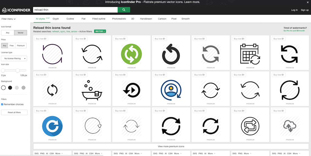
For example, when you want to find a flat designed reload icon, you can search for “reload thing” on the site.

9. Token (Paid)

http://usetokens.com/

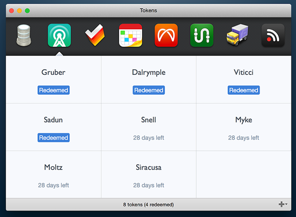
Token is a Mac app which makes distributing promo codes very easy.

Once your app has been approved in the AppStore, you can give promo codes to users so that they can use your apps for free or try the latest versions of your apps before you release them.

Recently, Apple has even allowed the distribution of promo codes for in-app purchases and subscriptions.

Even though users usually need to copy and paste promo codes on the AppStore, with Token you can send one easy link so that all they have to do is to just tap the link to paste promo codes on the AppStore.

You can even distribute a bulk of promo codes to random people. The only limitation is that you cannot use Token with two-factor authentication.

I mainly use promo codes to test my apps on the AppStore before I release new versions of my apps. You can test the released version of your apps on the AppStore against the sandbox version before you hit the release button.

8. Gengo (Paid)

https://gengo.com/

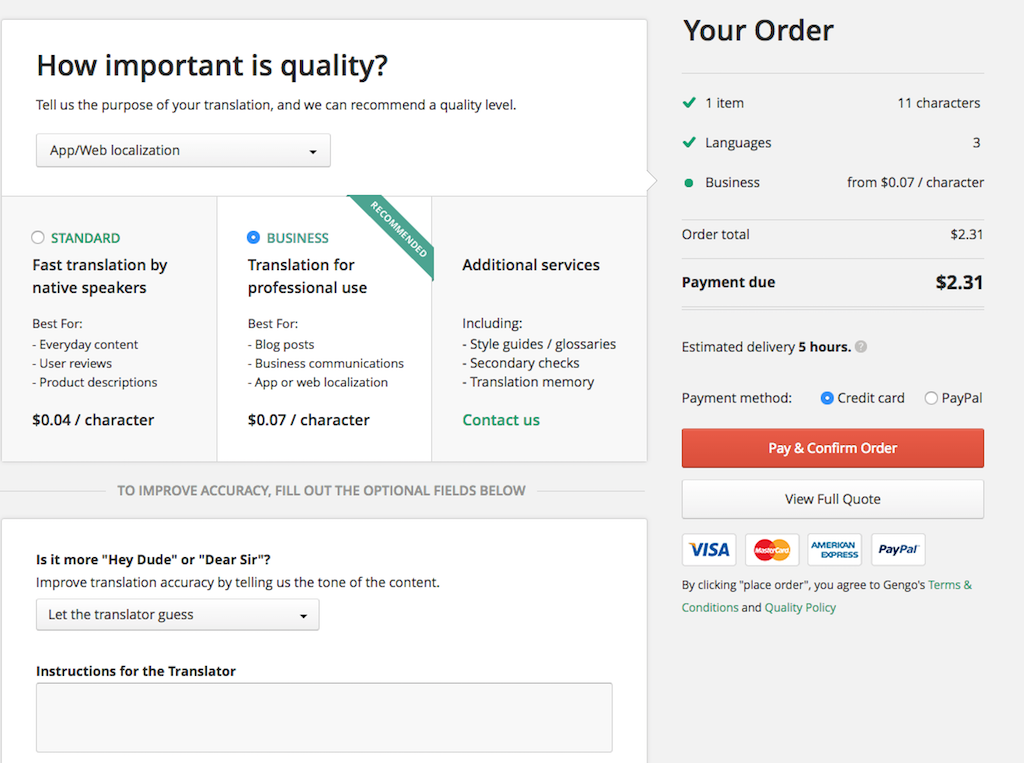
This service is not made for mobile app development, but I constantly use Gengo to localize my apps into different languages. This service is very easy to use and the translation speed is usually very quick.

I tried a few localization services made for mobile app development before I settled on Gengo, but I found that Gengo is the simplest and easiest one to use.

When you use it, you need to use [[[ ]]] to explain each sentence to make it easy for translators to understand. I also believe that it’s possible to pick translators who understand tech when you choose App/Web localization in the purpose section.

7. AppBot (Free + Paid)

https://appbot.co/

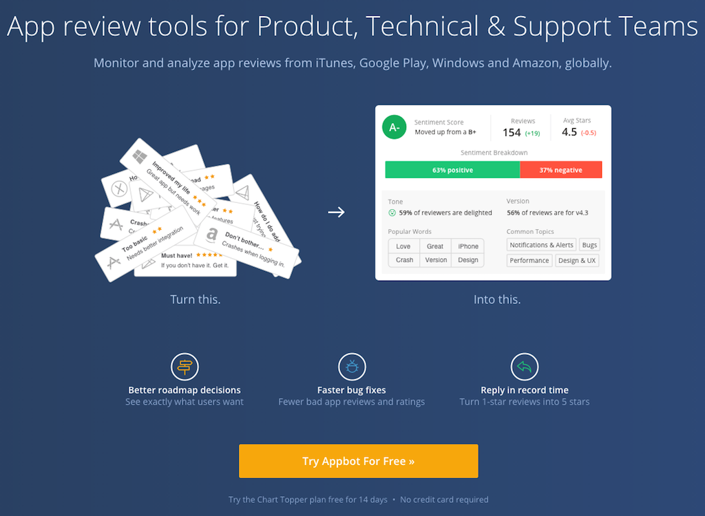
AppBot delivers the latest user reviews on the AppStore to your mailbox. AppBot also has several other features, but I only use the user review delivery function for free.

What I like about AppBot is that it delivers reviews from different countries to you, so you can be aware of users outside of your home country.

As a solo indie developer, updating apps alone every day is quite a lonely work so reading encouraging reviews from users really motivates me to keep going.

6. Screenshot Builder (Free + Paid)

https://launchkit.io/screenshots/

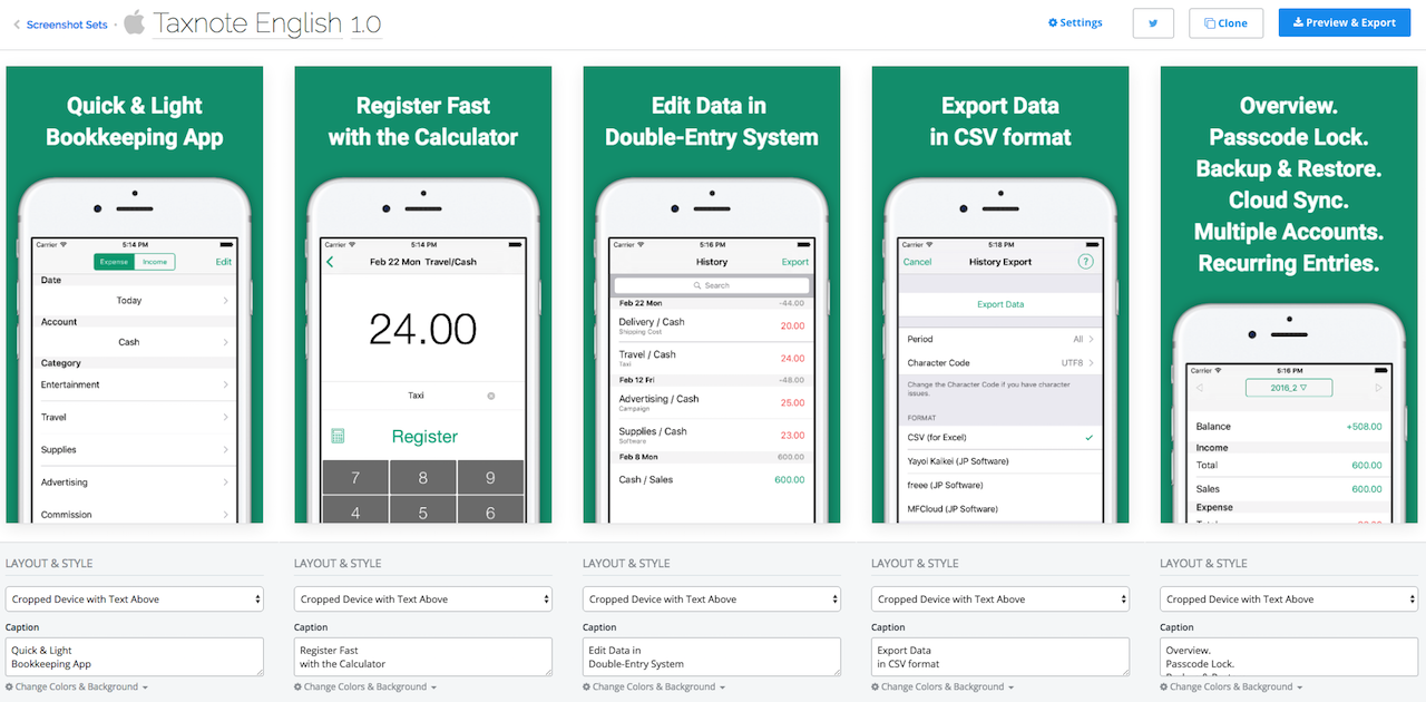
This is a very handy service when you want to create or update app screenshots. You can update each description, font type, font size, and background color easily, and it will create iPhone/iPad screenshots into different resolutions.

Without using this tool I couldn’t consider localizing Taxnote into 7 languages. The only thing is that you can’t reorder each screenshot after you create it.

5. Fastlane (Free)

https://fastlane.tools/

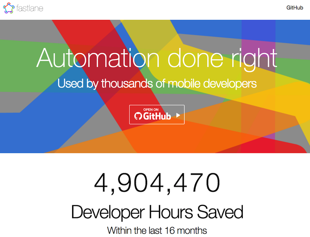
Fastlane is an awesome terminal base tool set for every iOS developer. There are several cool tools in Fastlane, but I mainly use Deliver.

With Deliver, you can upload screenshots, keywords, release notes, app names and so on using a terminal.

When you support iPhone and iPad and even localize your apps, manually updating their data on iTunes is a nightmare, but Deliver truly saves you time in this regard.

4. Mixpanel (Free + Paid)

https://mixpanel.com/

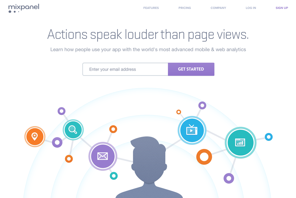
I’ve tried a lot of analytics tools for iOS, but Mixpanel is the best one for doing different kinds of custom analytics like funnel analysis with iOS versions, countries, and app versions.

It’s not an entirely free service so if you try to track the large volume of data in popular apps, you will easily exceed the free limit. Therefore, I use Mixpanel when I want to analyze specific segments.

I am also using Answer of Fabric for viewing broader numbers, but Mixpanel comes first when I want to do custom analysis.

Speaking of subscription data, including free trial and cancellation numbers, you can use the Analytics tool from Apple iTunes Connect. Each analytics tool has own strengths so it’s good to use several tools at the same time for different metrics.

3. AppAnnie (Free)

https://www.appannie.com/

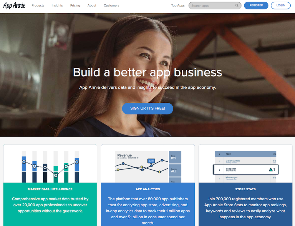
AppAnnie is a very popular service that enables you to see downloads and sales data on the AppStore and GooglePlay.

It’s much easier to see downloads and sales based on app versions, countries, and date using AppAnnie than it is with Apple iTunes Connect.

AppAnnie also features its App Store Optimization (ASO) tool which helps you find better keywords or titles for your app on the AppStore, and I believe this is the de facto standard tool for doing ASO nowadays.

2. Fabric(Crashlytics・Answer) (Free)

https://fabric.io/

For mobile developers, Fabric is a useful analytic tool provided by Twitter.

The great thing about Fabric is nothing but design. It’s elegant and easy to see data in different formats: I’ve never seen an analytic dashboard as great looking as Fabric yet.

With Crashlytics, you can track crash data from your apps so you can easily track how your apps crash based on detailed stack trace, app versions, iOS versions, and so on.

With Answer, you can track app downloads, active users, retention, and more. The retention dashboard of Answer is especially useful compared to other analytic tools.

The only down side, and it’s a big one, is that Answer only shows the recent month’s data in the dashboard.

1. Helpshift (Free + Paid)

https://www.helpshift.com/

With Helpshift, you can implement a support box which helps you communicate with users. If you want to update your apps based on user feedback, this is an essential tool for you.

By using Helpshift SDK, your users can send questions or requests inside your apps easily, and you can reply to them directly via chat box.

You can also implement FAQ inside your apps and manage the service on the server using Helpshift SDK. It’s very efficient since you can even easily localize the FAQ.

I believe I couldn’t get enough feedback from users without Helpshift, since contacting developers via email is a pain for anyone and you end up missing important feedback because of that.

Hearing user feedback is crucial for me when I am updating my own apps, so using Helpshift is really useful.

*Related
The Easy Way To Improve User Interface Designs
How do you say No to users without annoying them?

*I've made Text-to-Speech, Money Tracker, and Timer apps. About Me.


The Easy Way To Improve User Interface Designs

There is one easy and secure way to make good user interfaces for mobile apps.

That easy way is simply to listen to users’ questions. More specifically, design your mobile apps so that users can ask you questions very easily, then update your interfaces little by little based on that feedback.

It doesn’t mean you add new features, but that you make everything intuitive every time you find that some users find certain interfaces difficult to understand.

However, most developers do the opposite because they don’t want to spend time on user support; we still tend to set a user support button in somewhere hard to find.

Even though I understand the cost of answering every question as an indie developer, I’ve realized that answering users’ questions is the most cost effective and easy way to improve user interfaces.

Again, I am not talking about cool and sexy UI here, just intuitive and easy to understand UI for users of your apps, not users of other apps.

Before you release your apps

If you haven’t released your app yet, you can’t get real feedback from users. Polishing designs at this stage is so difficult because everything depends on your experiences.

Basically, you need to focus on one thing instead of building something which can do many things, and try not to add too many buttons and features at first.

This is easier said than done because everyone’s situation is unique, and a lot of trade-offs will come up anyway.

The most important thing here is to figure out the priorities for your apps.

How do you find target users?

You can’t easily identify target users of your app without releasing it, since each app has different users.

For example, when your app has a refresh button which reloads data, you might think about setting a “Pull to Refresh” feature which operates in the same way as the Twitter app.

If you make “Pull to Refresh” available, you could remove the reload button and save the space to make your app look simpler.

However, when the majority of your users are not tech savvies, it might be better to keep the button. The difficult thing is that you will never know the priorities which help your UI decisions before you release your apps.

Without releasing apps and answering questions from users, you can only guess the demographic of people who will use your apps and you could easily guess wrong.

Therefore, don’t believe that you can make a perfect user interface which suits your target users before you release apps. Just release apps fast and get real data about your users to polish UI to make everything easier.

Decide your priority based on users’ questions

Let’s say you’ve released your app now.

I guess you worried about each design, with questions like: “Do I need to add more descriptions on that message?” or “Will users find that feature?” But, you released your app fast before making everything perfect anyway.

Before releasing it, prioritizing which design features you should improve is always difficult. But, once you start getting real questions from users, it gets easy all of a sudden.

You simply start improving each interface, message, and button based on the most popular questions from users. This gives you a very easy and clear indication of how you can use your time.

After making improvements to your interfaces, if you don’t receive the same questions from users any more, it can be a good sign that they understand each element now.

Find something you couldn’t imagine before

So far I have written about how you prioritize tasks for improving user interfaces. But, the very crucial part of improving designs is to find something you couldn’t imagine before.

This comes from outside of your imagination, so you can do nothing in advance. You will find it out only after someone mentions it to you.

This is like one of those “Aha, I couldn’t imagine that people would misunderstand this message that way!” moments.

Actually, over 90% of user questions could be something you already know that you should improve, but you simply don’t have time for yet.

However, people occasionally give you insights you couldn’t forecast alone through feedback, and this moment is very important.

This kind of feedback makes you see your apps from a different angle, and sometimes you can fix them in very simple ways because you didn’t think about them in that way before.

If you already know the issue and haven’t fixed it yet, that means it will take time to do, and you’ve decided to do it later. For example, you can make some UI more intuitive using animations, but that implementation usually can be done later.

But, if you didn’t even realize the issue, it could be something you can fix right away like just changing messages.

Detect features users don’t realize

When users request features that your app already has, that means users haven’t realized they are there.

The fact that users don’t notice certain features means that the feature doesn’t exist for them even if you took a lot of time to develop it.

Sometimes it can be ok if your app has tons of features, but if you make relatively simple apps, this is a problem.

The good news is that you can detect this problem easily via the number of questions from users. If users often request features which are already implemented, you should improve certain aspects of the UI to make them detectable.

From my experience, I found that a lot of users don’t know even basic features of iOS apps like “Edit” or “Reorder” in TableView, so it’s better to suggest how to use them.

Real insights for what to do next

You probably have a lot of ideas about new cool features for your app.

You also believe you know what the most important feature is that you need to develop next, but how can you tell how accurate your knowledge is?

Again, you can easily check that accuracy from user feedback. If your users frequently request a feature you are now developing, that means your instinct was right, and you have a solid confirmation of it.

If your users often request other features which you thought were not so important, it might be time to change your plan.

Let’s say you had an idea about a feature that would be nice to have, but nobody requested it. It could be something great that users couldn’t imagine, but at least you can tell it is not urgent for now.

When users request something, you can even ask them a question like: “I am thinking about implementing a feature like this – what do you think?”

You will be unlikely to have an opportunity like this before you release your app, since it could take a lot of time to find a user who likes it and wants the same features as you.

How can you do this?

If you are a startup founder who is willing to do anything for your company, you can even write your phone number on the support page.

I am personally using Helpshift to set up a feedback box inside my apps and answer questions 1 or 2 times a day.

Even though it doesn’t take too much of my time for my small apps, the reward is huge and I can’t think of a better way to improve the design of my apps so efficiently.

*I've made Text-to-Speech, Money Tracker, and Timer apps. About Me.


We use tech-terms without notice in our apps

I believe the most important thing in mobile UI design is text messages used for buttons and messages.

Regarding that kind of design, you don’t want to use artistic expressions like in novels; it is better to use simple, specific, short, and easy to understand phrases.

This is easier said than done, because you always have bias in your mind about what phrases are understandable for most users, and it’s difficult to remove this bias.

Can you use icons?

First of all, you think about using icons for buttons instead of text. If you use icons, you don’t need to localize them for different languages.

However, you have to know which icons are most popular for different usages, and if users can’t tell what some icons mean, then they need to tap them first to find out.

The difficult thing is that even if you believe some icons are often used in iOS default apps and their meaning is obvious to most people, you could easily be wrong.

You are an iOS developer or designer who knows a lot about iPhone apps already, but for someone who came to iPhone recently, a lot of icons could be new things.

After I realized this, I started to use text messages for buttons as much as possible.

Short but understandable messages

When you make messages on alerts or dialogs, nobody reads them if they are too long. Users just glance them and skip them quickly without understanding them.

Having said that, if you make them too short, you end up making vague messages which are not clear. This balance is very difficult to achieve so I constantly update each pop-up and dialog message based on user feedback.

If you get questions from users about each dialog, that means they didn’t understand very well.

For example, messages about in-app purchases are very important in app design, since people get very anxious right before they decide to pay.

You need to explain how it works and write answers to questions people might have before they spend money.

Let me show the history of each message about in-app purchases for my app ListTimer, an iPhone/iPad universal app.

Example 1:
Thanks for considering the upgrade! If you purchase it, paid feature will be unlocked!

In this case, you don’t need to write the first phrase, and ‘unlock’ is too vague.

Example 2:
The upgrade version will remove ads!

This is shorter than example 1, but I got a lot of questions in this case.

The most popular question was whether it was monthly payment or one-time purchase.

Even if the upgrade looks like a one-time purchase and you know that iPhone always shows a different dialog if it is a monthly payment type, people always get worried about it before they pay.

The second most popular question was whether they needed to pay again when they changed iPhone devices. With iPhone, you can restore your purchase as long as it is one-time purchase type, but many users don’t know that.

So, I changed it to this:

Example 3:
The upgrade version will remove ads! This is a one-time purchase, and you can restore it for free when you change iPhone devices.

However, people sometimes didn’t know the meaning of ‘restore’, and they asked me if they needed to upgrade again when they used the iPad version.

Since ListTimer is a universal app, you don’t need to pay again for the iPad version when you have already paid for the iPhone version, so, I made it clear:

Example 4:
The upgrade version will remove ads! If you upgrade it in iPhone version, you can upgrade it for free in iPad version. This is a one-time purchase, and you can upgrade for free when you change iPhone devices.

This is a quite long message, but since this was a message about payment I thought it was worth doing.

Use easy words for non-tech people

Using easy and simple words is also important.

I believed that I should use the standard words used in iPhone itself, but I realized a lot of people don’t understand them.

For example, we developers know the meanings of words like flick, storage, and restore, but some people don’t understand what they mean.

One day, I got a message from a user asking “what is iOS?” This moment was quite a shock for me since I believed everybody could understand that term.

Now, I always try to use easy words and explain things in very specific ways when I talk to users.

When users send messages to us, and we reply with tech-terms that they don’t understand, I bet they would hate to ask us for the meaning of them again.

Some people might google it, but we know human beings are usually lazy, so they could give up and just leave.

I often forget this, but we should keep it mind and try to remember.

So, how do you do that? Well, I cannot think of any easy way, so let’s remind ourselves again and again and double-check our words in support messages and in-app messages.

Eventually, you will reduce a lot of easy questions from support and save your time in the end. That is what happened to me.

*I've made Text-to-Speech, Money Tracker, and Timer apps. About Me.


How to learn programming without getting stuck

I’m an indie iOS developer who sells an accounting app called Taxnote. Users of this app have been requesting the cloud sync feature for a long time.

So, I started using Parse, which until last year was the best tool for mobile developers who didn’t want to handle server side programming.

Unfortunately, Marc Zuckerberg decided to kill the service and I didn’t have a choice other than to dump my codes, which I spent 5 months doing at the beginning of 2016.

At that point, I finally decided to learn Ruby on Rails to write server side in order to make the cloud sync feature for Taxnote.

I am lazy, which meant I really wanted to learn it very efficiently. This led me to try a new way, which worked very well, so that’s what I’m going to write about.

It’s not pair programming precisely, but it is something like that.

The hardest part of learning new programming

I believe the most difficult part of learning new programming is not the very first step.

It is just after you have finished doing tutorials or learning the basics. You can find tons of good tutorial videos about programming languages or frameworks that you want to learn these days, so it’s easy to do the first step by yourself.

However, once you want to go on to the next step – for example, you want to build something out of your idea – you easily get lost. When you actually start coding, you will come up against a lot of unknowns, and in most cases you cannot find answers from tutorials.

I think this is the biggest barrier for learners since you can’t even guess how to google it when you don’t know what to do next.

In my case, I started doing several Ruby on Rails tutorials and learned the basics first. Then, since I wanted to build background api for Taxnote, I needed to know the latest practices for making api URL, how to make database structures, which gems I should choose, which server I should pick, and so on.

Google works very well when you are researching something specific in relation to your programming problem and you are already experienced with that domain, but it doesn’t work when you want to hear advice or suggestions from experts.

There were too many questions I wanted to ask people who know what to do, and I knew I would make bad decisions during development if I kept working solely with Google searches.

Find a mentor from Upwork

At the time, I thought I could use Codementor https://www.codementor.io/ to ask experts about what to do next. But I realized it is a bit expensive to find a long-term mentor there.

If you ask for help from good programmers on Codementor, it costs 20-30USD per 15min, since the service was made for solving your questions right away.

Then I decided to use Upwork to find a Ruby on Rails mentor. What I tried my best to do there was to write the description for my needs in as much detail as I could, since the teaching programming is very broadly based on each student’s level and what they want.

I explained that I knew iOS programming and wanted to learn Rails to make an api backend. I also added that I had already done some basic tutorials and I only needed to learn the skills that were required to build my service.

My particular idea was to watch someone’s live coding via Skype, so that I wouldn’t have to write codes by myself. Based on my experience from Codementor, I realized that if I coded by myself while listening to someone’s advice, it would take a lot of time and slow my learning experience in the end.

It worked really well and meant that I could learn very efficiently by explaining what I wanted to do and just watching an expert coding. I simply uploaded everything via git, then my teacher coded and explained. After each lesson ended, I downloaded the code and reviewed it alone.

Even though it required a lot of my energy, since the way experts code is much faster than I do, it was very efficient and I liked it.

How you pick your mentor

After I posted my offer on Upwork, I got over 10 candidates within 2 days. My hourly rate range was around 10-40USD, and each candidate requested between 10-40USD.

Some candidates obviously sent their letters without reading my detailed descriptions, so I filtered them first. Then I did sessions with 3 candidates, one by one.

You can’t tell their level of experience and how well they teach from their descriptions and offer letters, so it is best to do sessions with them anyway. You can learn a lot from that.

Some mentors taught me what to do only after I explained what I wanted, but good ones suggested good practices on Rails and gave the reasons for them in detail.

I did sessions with mentors asking for 20-45USD per an hour, and I ended up choosing the most expensive mentor (45USD) in my budget because it turned out I could learn very fast from him compared to the others.

For me, it was the best decision since he taught me how to code cleanly in Rails, which is quite a difficult skill to master when trying to learn with Google.

Efficient learning

Basically, I did pair programming with my chosen mentor for 2 hours per session and reviewed it afterwards alone.

During the sessions, I tried to learn things which were difficult to learn by myself and asked him to show me the keywords or references if new topics were something I could learn alone later.

For example, if I need to know how to use some gem from the Github page I can google it and teach myself, but when it comes to writing data structures for my service I need advice.

It was the most efficient learning experience since I didn’t get stuck at all thanks to his help, even though there was a great deal I didn’t know about Ruby on Rails and backend server coding.

I learned a lot from this pair programming and I was able to keep going alone with Google after 5 sessions unless particularly difficult tasks showed up.

It might work when you hire programmers

I thought this pair programming thing might work when you want to hire programmers for your new projects.

If I want to hire an Android developer for Taxnote, for example, I am thinking about doing pair programming first. I can learn some basic Android developments and observe how well each developer codes and handles errors.

When you talk with developers, you learn something you can never find out from their resumes, so this pair programming thing was the best experiment I did this year.

The Upwork Post

I got an email from iOS developer who want to do someting like this and he requested the original post on Upwork, so I share that here.

*I've made Text-to-Speech, Money Tracker, and Timer apps. About Me.